By Paul Giles
I have published quarterly ONS trade data-based charts here for some years post-Brexit.
They include ongoing estimates of the Brexit “hit” to the most vulnerable section of UK international trade, i.e. real value UK goods exports to the EU.
With the quarter 3 2025 trade data recently published, the charts have been updated and are shown below.
Chart 1 – Real EU goods export values
This first chart is the one most regularly published. It shows EU real export values since Brexit, updated to Q3 2025.
“Real value” means excluding inflation which would otherwise distort the comparison with Q3 2025. The ONS provide inflation-adjusted data as chained volume measures (CVM). CVM requires a reference year, just updated from 2019 to 2023, and this gives an estimated hit to Q3 2025 of £140bn.
The charts for full year 2024 indicated EU goods export values to be in “freefall”, but the first three quarters of 2025 indicate that this is no longer the case. The UK may have “levelled out” at 2025 values, which are about £30bn per annum lower than pre-Brexit.
As the chart indicates, this would result in a cumulative loss of about £400bn by 2035. This assumes that the UK continues to be “stuck with Brexit as is” through to the normal ONS projection horizon of 2035.
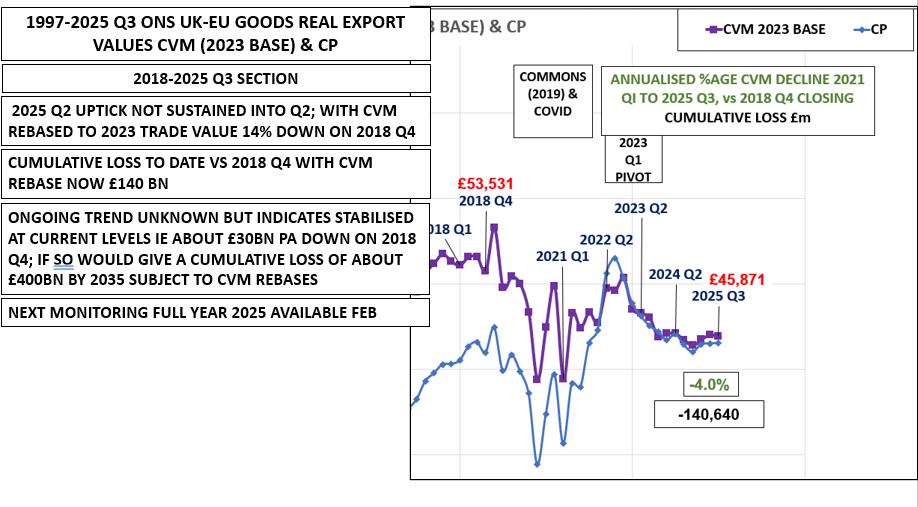
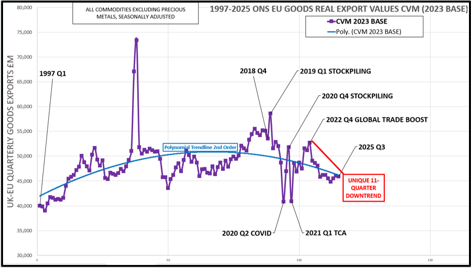
Chart 2 – Real value EU goods export trend since 1997
This new chart shows a summarised version of “recent” ONS UK history, i.e. the nearly 30 years 1997 to date.
The volatility around the 2019 failed Commons attempts to pass the EU Withdrawal Act followed by similar volatility in 2020 from the effects of the Covid lockdown(s) are stark.
At the end of 2020, goods stockpiling in anticipation of the Trade and Continuity Agreement replacing the single market from 1 January 2021 stands out, as does the resulting fall in trade in Q1 2021.
The polynomial trendline makes clear how the rise in EU goods export real values pre-Brexit was replaced by the fall post-Brexit.
From the end of 2022, we have then seen values in “consistent freefall” to an extent not seen in the past 30 years, followed by an indicated “levelling out” at the lower level.
I trust these charts make interesting reading and I look forward to the full year 2025 update in early 2026!


It’s fascinating to see the general sense of stagnation in European trade confirmed so strikingly by these data . Are they on posters anywhere, or should they be? Or in some public collective forum in addition to social media? There is something of a conspiracy of silence at the centre.